
| Vol. XXIV, No. 3 | January, 2012 |
Articles in Vol. XXIV, No. 3
Website Review: Ara Pacis Augustae
In-depth visual documentation.
-- Martin Beckmann
Websites as Stable Resources
Too many have disappeared.
-- Harrison Eiteljorg, II
§ Readers' comments (as of 2/8/2010)
Website Review: Dikili Tash
A good beginning, but only a beginning.
-- Andrea Vianello
Evolving Web Standards: a Blessing and a Curse
Why eliminate good, useful tags?
-- Harrison Eiteljorg, II
§ Readers' comments (as of 2/3/2010)
Project Publication on the Web - Addendum
Making it clear that a final report is just that.
-- Harrison Eiteljorg, II
To comment on an article, please email
the editor using editor as the user-
name, csanet.org as the domain-name,
and the standard user@domain format.
Index of Web site and CD reviews from the Newsletter.
Limited subject index for Newsletter articles.
Direct links for articles concerning:
- the ADAP and digital archiving
- CAD modeling in archaeology and architectural history
- GIS in archaeology and architectural history
- the CSA archives
- electronic publishing
- use and design of databases
- the "CSA CAD Layer Naming Convention"
- Pompeii
- pottery profiles and capacity calculations
- The CSA Propylaea Project
- CSA/ADAP projects
- electronic media in the humanities
- Linux on the desktop
Search all newsletter articles.
(Using Google® advanced search
page with CSA Newsletter limit
already set.)
Website Review: Dikili Tash
Andrea Vianello
(See email contacts page for the author's email address.)
Dikili Tash
- URL: www.dikili-tash.fr/
- Authorship: Editors: Pascal Darcque and Zoï Tsirtsoni. Authors of texts, in addition to editors: Céline Choquenet, Rozalia Christidou, Haïdo Koukouli-Chryssanthaki, Dimitra Malamidou, Sandra Prévost-Dermarkar, René Treuil, Tania Valamoti, Julien Vieugué, and Stavros Zachariadis. Website developed by Julien Mahoudeau.
- Site host: Private hosting service based in the USA.
- Peer review: None stated.
- Permanence: No explicit information, but ALTEARCH-Médiation is in charge of the "development and maintenance" of the website.
- Archival procedures: None stated for the website.
- Languages: French and Greek (English forthcoming).
Dikili Tash is an important archaeological site near Philippi, Greece; it has been subjected to investigations and excavations by a French team since 1920. The Neolithic and Bronze Age strata are particularly interesting and well preserved, but there are also Hellenistic, Roman, and Byzantine remains.
General overview
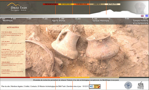
The design of the home page (Fig. 1) is multimedia-rich, with most of the space taken by a picture. The picture changes frequently; a few images rotate, with some fade-out between pictures. In a column on the left there is a short menu with a list of news items. Characters are, however, very small. The website has been validated to comply with the XHTML 1.0 standard, a standard last defined in 2002 and intended to result in a similar browsing experience with all modern browsers. The graphic is centered and there are two general menus, top and bottom, providing access to different parts of the website. The bottom menu only appears on the home page; it leads to a site map and management information (e.g., legal matters, contact information, and supporting institutions). Underneath the top menu there is a time line that provides access to a series of pages that outline the site's history. To the right two flags allow the user to select a language (French or Greek). Clicking on a flag on any page brings the user to the home page of that language.1
The home page is slow to load and hard to read, relying too much on visual impact, but it is unlikely that any reader will need to revisit the home page. The navigation is sometimes cumbersome. The text size, color, and background used for texts outside the home page make them easily readable. The sitemap link toward the bottom of the home page should have been on all pages.
This website only presents an overview of Dikili Tash, since it contains only short texts and a few images, but very little has been provided for archaeologists. Even preliminary reports are linked from a different website (chronique.efa.gr), and there are no PDFs. The website seems designed as an educational tool for a general audience, and this impression is strengthened by the presence of a glossary (lexique), which is present as a separate page. Definitions also appear throughout the website when the mouse hovers on selected terms (which are marked by color to let the user know what terms are so defined — but the color is also used to indicate a bibliographic entry and other matters as well). Figures in the text are usually without captions, but clicking on them opens a larger version, usually with a caption. The sophisticated interface enables a user to see all images on a given page (in sequence, one at a time, in an overlay window) and with captions when any image on the page in question is clicked. Some captions also appear when the user hovers over the image with the mouse. Captions, however, should appear in the text.
Fig. 1 – Dikili Tash Home page [Note that this and all other screen shots are
smaller than the user would see; therefore, each of them is a link to a
full-sized image in another browser window.]
The contents
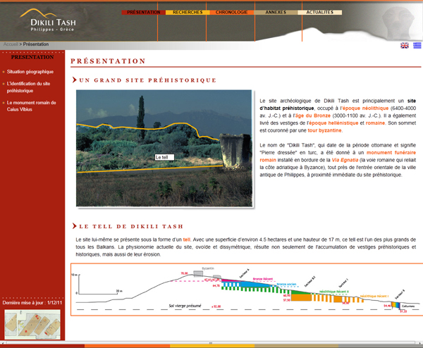
In reviewing the website, I follow the sequence in the top menu of the French version. I also checked briefly the Greek version, and it seems complete and to mirror faithfully the French section (even the news items are published in both languages). Section Présentation is very concise and largely descriptive. The opening page figure showing a Roman monument is actually interactive (Figure 2) and hovering the mouse on it identifies three different parts of the area in the image: the tell, the Roman monument, and the area in the background. The interactivity is lost in the larger version of the image. There are a schematic stratigraphic map of the site and a 3D map of the area in another page of the presentation. Perhaps because the Roman monument appears in the first image, the last page of the section contains a brief description with a full transliteration and translation, and the monument is mentioned in the penultimate page as well (in total the monument is featured in three out of the four pages in this section). Yet very little information is provided about this monument, and the page about how the site came to be identified is almost useless.
Fig. 2 – Présentation page
Section Recherches outlines the history of archaeological research at the site; there have been three distinct research phases. Very welcome is the inclusion of pages for additional studies: experimental archaeology, micromorphological analyses, organic residue analyses, and archaeobotanic analyses. I doubt, however, that somebody unfamiliar with the natures of these specific analytic techniques can understand much from these pages. For instance, a sentence such as, "Pour leur caractérisation, on utilise une série de techniques analytiques physico-chimiques, comme la Spectroscopie InfraRouge à Transformée de Fourier ou la Chromatographie en Phase Gazeuse couplée à la Spectrométrie de Masse," (http://www.dikili-tash.fr/content/recherche/analyses_residus.htm; accessed January, 2012) only lists the analyses being carried out. In fact, the caption of the only image in the page about organic residues provides clearer information, but that caption is accessible only after clicking on the image or hovering with the mouse on it, and it is cryptic.
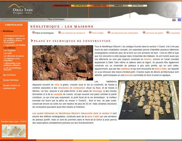
Section Chronologie is the most interesting. The landing pages only outline the chronology of each major period (Neolithic; Bronze Age; Historic period, defined as beginning in 1100 B.C.E. and ending with the fall of Constantinople; and the modern period). The navigation here is not as easy as it should be. For instance, on the page about the houses, a single image appears, with no text. Hovering over the image with the mouse indicates key sections and alerts the reader to the existence of further subpages such as Les maisons, figure 3. The pages in this section are very informative and contain many color images; once the user penetrates to the right level additional pages are linked intelligently with others. Captions, though, continue to be problematic; they should be visible at all times. Some pages are particularly informative and include several subpages. They deserve to be singled out: for the Neolithic section the houses, vessels, tools, ornaments, figurines, and cooking; and for the Bronze Age section the houses and tools. As is apparent from the list, most care has been devoted to the Neolithic section. The pages for the Bronze Age contain probably a third or less information compared to the Neolithic, and the remaining periods are barely mentioned. Readers will be comforted by knowing that the single page on the Roman period contains not only a mention of the Roman monument of Caius Vibius, but even a link to the page where the transliteration and translation appear.
Fig. 3 – Les maisons page
Section Annexes presents historic lists of directors and participants, a section with PDF documents, the glossary, a bibliography, and various pages with contacts, credits, and notices. The page with documents only contains four PDFs, of which one (dated 1920) was inaccessible at the time of this review. Two were only two pages long and also very old, and one was a paper in Greek. Essentially there are no recent papers in that section. The bibliography is a useful page that adds a few links to external papers, but I would have appreciated some extended preliminary reports or a few key articles. Section Actualités (news) contains short notices, some of which (e.g. the discovery of the earliest traces of occupation at Dikili Tash) would have benefited from a separate page with an extended commentary.
Conclusions
This is a useful website for anyone seriously interested on the Neolithic and Bronze Age periods at Dikili Tash. It has however a serious problem with the intended audience. The real contents are exclusively found within the chronology section, with a series of in-depth pages that provide an introduction to the site and its key aspects, especially for the Neolithic period. This core has been placed inside an otherwise nearly empty website, which is unsatisfactory to both the amateur and the general public. It may even push away archaeologists looking for content. Where content is provided, most is aimed at specialists and will prove cryptic to the general public. The brevity of the texts and their lack of citations will frustrate all readers, because the texts require too much sound knowledge of archaeology. They ultimately could say so much more with little effort. The graphics are also dysfunctional for this type of website due to the lack of captions, helping notes about interactive features, and pictures framed within texts producing complex layouts unsuitable for printing.
Ideally, section Présentation should be a slightly reduced and simplified version of Chronologie, targeting the general public and the amateur archaeologist. The latter section ought to be substantiated by citations and have its texts expanded; it should be squarely aimed as an introduction for archaeologists and anyone else who may have read and understood the simplified version but wish for more information. The glossary is a great idea, but it is insufficient to explain the archaeological terminology used in the texts and for this reason should be limited to the sections targeting the general public. Splitting the website according to audiences should not be abhorred; not everyone is an archaeologist or much interested in the details of the discipline. The same applies to any discipline, but this is not a good reason to withhold information or make it difficult to grasp the basics for those who have limited interest. General news websites (e.g. BBC News, MSNBC, etc.) typically summarize scientific papers making them understandable and link pages with further data (usually by the authors of the study being referred to) as well as the original papers being discussed. Archaeological websites should follow in the same path, with simplified summaries and real articles.
Here there is no simple summary, and, conspicuously, there are no papers or preliminary reports. Archaeologists can refer to the bibliography but will have to find the articles and books by themselves. The current articles in the chronological section are good enough for student essays, but they could have easily provided citable references for archaeologists if they contained a few references or were presented as extended articles by named authors. Not everyone needs to read or refer to a full paper if something of interest is briefly presented and perhaps illustrated within an article. A text such as this from the Late Bronze Age vessels page, "De nouveaux types de vases apparaissent aussi, tels des récipients doubles à anse de panier centrale, des bols globulaires munis d'anses verticales anguleuses qui dépassent du bord, et des jattes évasées à anses en lunette" (http://www.dikili-tash.fr/content/chronologie/bronze/bronze_recent_recipients.htm; accessed January, 2012) is far too complex for the general audience (it describes ceramic forms using strict archaeological terminology), but because it is essentially only a list of shapes, three in that specific sentence, it is not satisfactory for archaeologists either. Would anyone without a background in the archaeology of this time and place understand what are the "bols globulaires munis d'anses verticales anguleuses qui dépassent du bord" (globular bowls with angular vertical handles that reach beyond the rim) without seeing a picture? Would an archaeologist unfamiliar with the (French) terminology for the local ceramics understand what is meant by that description? And why does only the Greek version refer to the vase as a type of kantharos (κανθαρόσχημα)?
There is finally the problem with languages. An English version should be made available as soon as possible, not because English is a better language, but because it is the standard language for scientific communication, and most archaeologists who do not speak French or Greek will understand English even if that is not their mother tongue.
Some final remarks on the Dikili Tash website. First, different audiences must be identified. Then I hope that the texts will be both extended and simplified in future editions, producing two separate versions for two different audiences.
Second, a printable version ought to be planned. Currently the pages may print fine in some browsers (after reduction of the font size), but preserve the online layout. Considering that many people prefer to read long or difficult texts formatted with familiar book-like layouts, and some of the texts may end up as printed reading materials, a printable version ought to be a requirement for all sites with academic contents. In 2012 "printable" and "mobile" versions are offered by most content management systems as alternative layouts and do not require much work.
Third, PDF editions of the preliminary reports and selected studies should be made available (or similar texts produced and published as pages of the website). More information from the work at this archaeological site should be available here at this website.
Fourth, the material needs to be available in other languages. Since English has been planned, it will be interesting to see the forthcoming English translation to assess its agreement with the current pages. Translations are also useful in revealing elements of the original texts that may be improved to further their readability. Texts that are difficult to translate are also difficult to understand by non-native speakers of the beginning language, even if the texts themselves are written in the native language of the author and therefore are formally correct. In short, if translating the text into English or Greek presents difficulties or requires adaptations (as seems to have been the case in the Greek version), a native speaker unfamiliar with archaeology or a foreign scholar capable of reading French will have difficulties reading that text. This would be a pity, because the Neolithic and Bronze Age sections of this website can be useful already and have potential to be more useful in future, improved editions. Thus, the translation process may both provide a useful version of the original and help to make the original better.
Fifth, it would be much better to show the artifacts (or drawings/copies), so that precise terms and precise translation will not be so critical for a correct understanding of the archaeological evidence.
-- Andrea Vianello
Notes:
1. In the case of the Dikili Tash website, it is disappointing that at least a few pages are not ready in English three months after the launch of the website. The choice of using three languages is, however, positive. I would go further and add Polish (the presence of Polish-speaking students in addition to the French core team is mentioned), to be as inclusive as possible. I truly hope that the website will not end up like the current CSA Propylaea Project website (propylaea.org), which really ought to follow the same advice and complete the Greek translation (and, if I may say so, not intertwine the English and Greek menus, and use instead separate mirror copies of the whole website as is the case for Dikili Tash). Return to text.
All articles in the CSA Newsletter are reviewed by the staff. All are published with no intention of future change(s) and are maintained at the CSA website. Changes (other than corrections of typos or similar errors) will rarely be made after publication. If any such change is made, it will be made so as to permit both the original text and the change to be determined.
Comments concerning articles are welcome, and comments, questions, concerns, and author responses will be published in separate commentary pages, as noted on the Newsletter home page.
