
| Vol. XXVI, No. 2 — September, 2013 |
Articles in Vol. XXVI, No. 2
Website Review: Penn Museum Interactive Research Map & Timeline
One portion of the Penn Museum website.
-- Andrea Vianello
Of Layer Names — And Babies — And Bathwater
Layer names need not be useless to be clear
-- Harrison Eiteljorg, II
Archiving the Digital Files from the CSA Propylaea Project
Long-term preservation of the data files is necessary.
-- Harrison Eiteljorg, II
Aggregating Data — A Very Problematic Process
Scholars often need complex and sophisitcated data.
-- Andrea Vianello and Harrison Eiteljorg, II
Miscellaneous News Items — And Some Important Questions
An irregular feature.
To comment on an article, please email
the editor using editor as the user-
name, csanet.org as the domain-name,
and the standard user@domain format.
Index of Web site and CD reviews from the Newsletter.
Limited subject index for Newsletter articles.
Direct links for articles concerning:
- the ADAP and digital archiving
- CAD modeling in archaeology and architectural history
- GIS in archaeology and architectural history
- the CSA archives
- electronic publishing
- use and design of databases
- the "CSA CAD Layer Naming Convention"
- Pompeii
- pottery profiles and capacity calculations
- The CSA Propylaea Project
- CSA/ADAP projects
- electronic media in the humanities
- Linux on the desktop
Search all newsletter articles.
(Using Google® advanced search
page with CSA Newsletter limit
already set.)
Website Review: Penn Museum Interactive Research Map & Timeline
Andrea Vianello
(See email contacts page for the author's email address.)
Penn Museum Interactive Research Map & Timeline
- URL: www.penn.museum/timeline/web/
- Authorship: Individual researchers are stated in many sections, but due to the complexity of the website there is no fixed team. Web Developer is Bluecadet. a web-design firm located in Philadelphia.
- Site host: University of Pennsylvania.
- Peer review: None stated.
- Permanence: No explicit information, but it has been available for some time. Website has long tradition of preserving resources and an active program to maintain usability of old resources.
- Archival procedures: None stated for the website.
- Languages: English
Preface
In the previous issue of the newsletter, I wrote a long review about the whole Penn Museum website. My aim was to look at a very large website and assess the challenges and successful solutions that would be typical of such websites. Unsurprisingly, the review depicted a mixed situation, where plenty of useful information produced through several years was published in an uneven website that looks and feels fragmented.
In this review, I am looking at a specific section of the website, the interactive (Flash-based) map and timeline that is offered as a primary resource in the Research section of the website. The reason for this additional review is to concentrate on the quality of a specific resource rather than the overall website and its presentation.
Description
The map and timeline is a neat resource, presenting the research carried out by museum staff across the globe throughout its history. On top of a map (Fig. 1), several pictures provide access to the geographic sub-sections. Hovering the mouse on any one of them yields the assigned name; and clicking will present an enlarged map with the specific countries and numbered signposts. The numbers refer to the number of projects available at that location. Clicking on one of them opens up a list of projects. On the left a helpful menu allows the user to return to previous steps. The lower bar instead allows the user to select a number of chronological periods, from the very broad, e.g. 100,000 to 10,000 years BCE to relatively shorter periods, e.g. 500 BCE to 1 CE. A short comparison with Heilbrunn Timeline of Art History published by the Metropolitan Museum of Art (starting here: metmuseum.org/toah/) shows the main problem: the regions do not follow a proper geographic scheme, with Europe, the Mediterranean, the Near East, Egypt and Africa all overlapping one with another. The choice of periods for the timeline is, however, fine, and generally the Penn Museum map appears neater and simpler to use than the Heilbrunn Timeline. Selecting any period will trigger the appearance of some pictures, above the areas in which there are projects to display. Clicking on one of them will produce a similar effect as when accessing the map directly. A list of projects will be displayed, but this time only projects concerning the selected period will appear. Given the breadth of the map and timeline and the number of projects, I would have welcomed a textual search box or drop-down menu. There is nothing easier and more compatible than basic text, and although it may look less interactive, it is still preferred by many; text can be so much more clear. The list of projects that appears after some selection is consistent. A hidden intro can be accessed through an arrow on the top. This would be best presented on the home page or automatically at the first selection. As it is presented, though, it may go unnoticed. For each project there is a series of slides (colour or B&W), project name, the years that the project was run, the name of the researchers, the period studied (sometimes expressed in years only, and sometimes also expressed as a cultural period – e.g. "500 BCE - 262 CE Classical Greek to Roman Period"), a short description (with a clickable arrow to extend text in most cases), and a hidden section "more" (click to reveal), containing mostly articles published in the museum's Expedition Magazine (they open in a new window as PDF files). A relatively invasive button allowing the user to "share" the contents on social media appears almost everywhere. I doubt that many researchers or members of the educated public feel the urge to share what they are learning, and this is a clear case of nerdy advertisement gone too far. The share button at the top of the resource makes some sense, but for the rest, I really cannot see the need to involve social media at every point. I would omit this, especially considering they are currently run by private companies and open to all the public. They are definitely not private spaces. A bookmarking function would have been preferred, to permit the user to collect a specific set of projects that may interest him/her and give faster access to those.
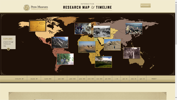
Fig. 1. The landing page of the Research Map & Timeline section of the
Penn Museum website. (Click here to see it at full size.)
Even with such basic information provided at this level, mistakes abound. Case in point: the "period studied" field which is sometimes populated by the same dates as those for the project. One only has to select Libya to see the problem (Fig. 2). For instance, a project run in 1962, such as the Cyrenaica survey, will appear in project dates as "1962 – 1962" (evidently no one thought that a project may be run for one year only) and appear as "1962 CE – 1962 CE" in the period studied field. Luckily, the timeline does not use that date, but the overview seems an amateur production. In spite of these minor setbacks, the rich collection of resources offered by the museum remains the highlight of the map, which is nothing more than a portal to scattered resources. For instance, to use the same example of Libya, the whole collections database of the dig at Leptis Magna is available.
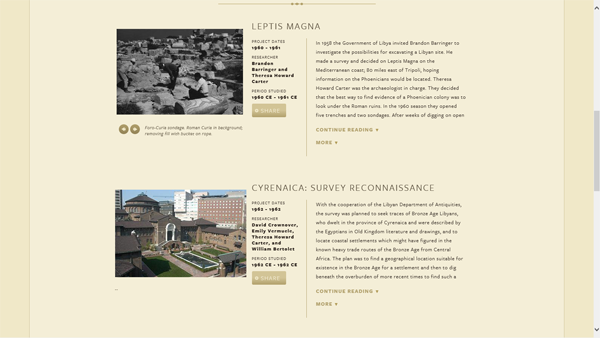
Fig. 2. The LIbya page of the Research Map & Timeline section of the
Penn Museum website. (Click here to see it at full size.)
One, many, all
The Penn Museum website's Collections database takes a different approach. Using a different interface and a bookmarking facility, the Collections database, when compared to the Timeline, illustrates the main problem of the website: the many interfaces and idiosyncrasies in the interfaces. The Timeline is a very useful resource, but it is buried in the map and opens in a new window, activating a search and returning an error. From the advanced search interface it is necessary to move to the keyword search to perform the first search. All this lack of attention for little details unnecessarily complicates access to an otherwise excellent resource, which would be the highlight of many other websites. The reason for opening a new window is that there is no way to return to the map from within the resource. The database is actually a sub-set of the museum's catalogue, which contained at the time of review 334,206 object records, 44,798 of which pertain to Leptis Magna. The database itself also contains multiple pictures. Access to the catalogue should be handled transparently through the Flash interface, perhaps using its own interface. After all, one of the advantages of a relational database is that it can be queried from different interfaces (presenting or hiding any set of the stored data) while the actual data are stored and maintained in a single location. To force an interface is a mistake
There is a helpful page providing instructions for the database, but, even so, I feel that there should be a coherent strategy to present most research resources. In the end, it is not possible to assess one section of the Penn Museum without considering many others that support and integrate the chosen one, and the bewildering number of resources, each largely independent and disconnected, hampers proper access to what the website offers and may even succeed in hiding some of the resources. There is a need for one interface, and I think that the map and timeline could be the right choice. As we have seen in the previous review, not all research resources are directly linked within this interface, or any other for that matter, but they really should be.
Of course, there are many resources linked in the more section, including videos (on YouTube and Archive.org), various documents (such as finding aids, indexes to collections), ebooks (on Google Books), book records (on WorldCat), separate websites, sparse articles within the greater website, press releases, blog posts, records of PhD dissertations, links to independent and separate websites, newspaper articles, Wikipedia articles, and probably other types of resources. In some cases (see Fig. 3) the more section is empty (e.g. Tepe Hissar reexcavation) and sometimes absent (e.g. Tepe Hissar publication project). This happened more frequently than I expected.
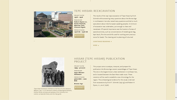
Fig. 3. The Tepe Hissar page of the Research Map & Timeline section of the
Penn Museum website. (Click here to see it at full size.)
Errors (Fig. 4) are few and far between (e.g. a newspaper article is listed as "Anthropologists study Nethandreal Evidence in Southwest France" under the La Quina project, and the third word should read Neanderthal). Of course, that is the one word that professional archaeologists and anthropologists should not have misspelled. There are also minor inconsistencies, with similar resources being presented the same or very differently, which add to some uncertainty about the contents (different audiences targeted and non-academic resources are intermixed with academic ones). In some cases, BP (before present) and BCE (before common era) dates are mixed (e.g. Pech de l'Azé IV, period studied: 90,000 BP - 35,000 BCE).
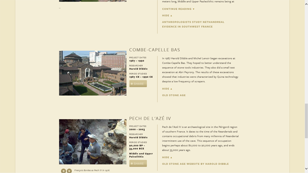
Fig. 4. The page of the Research Map & Timeline section of the
Penn Museum website showing Pech de l'Azé IV information.
(Click here to see it at full size.)
The chaotic bundling of resources has produced clearly dysfunctional situations, such as the two websites of the Corinth Computer Project (Fig 4). In many cases (as long as your browser allows opening pop-ups) plugins, subscriptions and payments are necessary to access the resources. This is wrong. Pages that require special technical requirements (other than those required to access the map) should make it clear which plugins are required and link to a page where it is possible to download them. Resources behind a payment wall should also be differentiated in method of presentation.
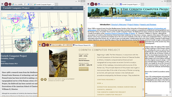
Fig. 5. Two pages of the Corinth Computer Project on the Penn Museum website.
(Click here to see it at full size.)
The map and timeline bring a variety of resources together indistinctly, and this is a pity because, with a little more effort and planning and I am sure not much additional cost, the website could become a reference model. As it is, dysfunctional is the word that best describes it. It looks unfinished in this close look, as many other websites that are part of the greater Penn Museum website do. A portal that is incomplete has little value.
Discussion and conclusions
I am in favour of maintaining separate resources and linking them intelligently rather than aggregating them into a single resource. This website manages neither intelligent linking nor aggregation. An intelligent interface can mask diversities and peculiarities and really facilitate access to the resources, which is the main aim for providing them in a digital format. For instance, a simple code system that attaches a symbol to certain types of resources would be sufficient to distinguish among them. I would recommend that each project, instead of remaining fixed in the list of results, can be expanded to a full page, and then all free internal resources should be automatically unhidden. It is only a matter of the design of the interface, because the contents, for the most part, are there. Work on the collections catalogue continues at a good pace. I also think that the timeline should not force a choice of a single region, and rather be more configurable. It is an excellent learning tool, which would even benefit scholars. Unfortunately, it falls in the trap of over-specialisation, representing just one period in one region. For an interactive map, I would like to see much greater freedom in choosing and playing with different options.
To conclude, the interactive research map and timeline has demonstrated great potential and gained much appreciation as a portal to so many resources. Quantity alone, however, does not suffice when we consider what is effectively the business card of the museum, the interface that allows researchers and learners to approach its collections before visiting the museum. Here, quality is the only discriminant for assessing the website. And this specific resource, which is the entry portal to the many online resources offered by the museum, fails on multiple levels. Partly because it seems unfinished, partly because it seems to lack planning for what there is, and partly because it does not aggregate otherwise sparse data, just mixing some. Web publishing needs greater understanding and greater commitment to see the project through. Having a good idea and many resources available does not automatically produce a good publication, either on paper or online. Given the amount and breadth of online resources currently linked by the Penn museum, an improvement to the interactive research map and timeline, or a substitute, is much needed and overdue.
-- Andrea Vianello
All articles in the CSA Newsletter are reviewed by the staff. All are published with no intention of future change(s) and are maintained at the CSA website. Changes (other than corrections of typos or similar errors) will rarely be made after publication. If any such change is made, it will be made so as to permit both the original text and the change to be determined.
Comments concerning articles are welcome, and comments, questions, concerns, and author responses will be published in separate commentary pages, as noted on the Newsletter home page.