
| Vol. XXIV, No. 1 | April, 2011 |
Articles in Vol. XXIV, No. 1
Project Publication on the Web — II
What are the motivating factors?
-- Andrea Vianello, Intute and Harrison Eiteljorg, II
Website Review: Archaeological Institute of America
The AIA's redesigned website.
-- Phoebe A. Sheftel
Website Review: Kerma
An archaeological project from Africa on the web.
-- Andrea Vianello, Intute
Calibration or Ground-Truthing Is Critical
Confidence in analyses requires confidence in the base data.
-- Harrison Eiteljorg, II
Let Us Set the Mental Juices Flowing
Artifacts should tell a story, not be the story.
-- Harrison Eiteljorg, II
To comment on an article, please email
the editor using editor as the user-
name, csanet.org as the domain-name,
and the standard user@domain format.
Index of Website and CD reviews from the Newsletter.
Limited subject index for Newsletter articles.
Direct links for articles concerning:
- the ADAP and digital archiving
- CAD modeling in archaeology and architectural history
- GIS in archaeology and architectural history
- the CSA archives
- electronic publishing
- use and design of databases
- the "CSA CAD Layer Naming Convention"
- Pompeii
- pottery profiles and capacity calculations
- The CSA Propylaea Project
- CSA/ADAP projects
- electronic media in the humanities
- Linux on the desktop
Website Review: Kerma
Andrea Vianello, Intute
(See email contacts page for the author's email address.)
Kerma
- URL: http://www.kerma.ch/index.php?lang=en
- Authorship: Archaeological site directed by Prof. Matthieu Honegger. Contents developed by the Mission archéologique suisse au Soudan. Website developed by Archeosites.ch.
- Site host: Private hosting service based in Switzerland.
- Peer review: None stated.
- Permanence: No explicit information.
- Archival procedures: None stated for the website.
- Languages: French and English
Kerma is a major archaeological site in Nubia (modern Sudan); excavations led by a Swiss team for more than thirty years have revealed a settlement and necropolis. The research project is concerned with the broader landscape and with monuments and evidence dating as far back as the Palaeolithic period, with some local surveys yielding materials dating to 200,000 years ago. This is an area where the origins of modern humans can be studied and where an early civilization, very much linked to the Egyptian one, emerged and developed locally. Despite the obvious importance of the region and even the presence of pyramids, Egyptian antiquities eclipse Nubian antiquities in the view of the general public. This website needs therefore to bring some very important information to the wider world.
General overview
The website appears to have been produced by a professional firm, but it uses an open source Content Management System (CMS), Joomla!, which allows contents to be added easily while providing some advanced management through simpler user interfaces. A news section clearly demonstrates that, after the original production of the website, staff of the archaeological mission has been able to add new pages and contents within the designed interface. The designed interface is neat, uncluttered, and professional-looking (fig. 1).
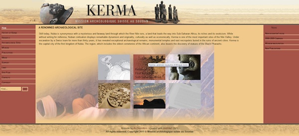
Fig. 1 - Home page [Note that this and all other screen shots are too small; therefore, each of them is a link to a full-sized image in another browser window.]
On the title bar, the name of the site is clearly visible. A discreet menu item, so small as to be easily missed, has only the letters F and E and allows users to switch between the French and English versions; its function is not immediately clear but it is easy to spot and use. Notably, the menu remains always present and the use of a dynamic website means that clicking on the E or F on any page will provide access to the same page in the other language. The main body of the website is composed of three columns between header and footer, and it adapts to fit the size of the screen, providing plenty of room in modern widescreen monitors or multiscreen arrangements. The left-column menu provides access to most pages in a couple of clicks, first opening the landing page of the selected section along with a list of subpages within the menu, then permitting the choice of any of the subpages. A search box is clearly visible at the bottom of the menu.
The central column of the main body is the area where contents are published, and it is spacious and dynamically fits into the browser window. The right-column menu may contain links to news and notes; in many pages it simply blends as a decorative part of the interface. The footer shows unobtrusive copyright notices and credits. The key advantage of the dynamic organization of the website is immediately evident when attempting to print any page: all contents and menus are seamlessly resized to fit the printed page and re-arranged to maintain the correct position of the elements. Moreover, parts unused in a given page, such as the right column where it is not used, are ignored and do not reduce the space available for the central column. Most modern browsers also remove (or allow the user to remove) the background, resulting in black text on a white background. The benefits of using a well-designed, quality CMS do not stop there: the website looked and behaved the same using IE9, Chromium 12, Firefox 4, Apple Safari 5, Opera 11, Opera Mini 6 for Blackberry, and QtWeb 3. The list is deliberately long because it is rare to find an academic website that looks nice, is kept updated, and works well with most current browsers.
The contents
The section History of Kerma contains a useful chronological table and a series of very short articles aimed at the general public or students, with links to scholarly publications where available. Some images accompany the texts and they appear as thumbnails on the right menu. Clicking on any picture opens the picture at the centre of the screen with a simple and elegant animation. Each picture is accompanied by a caption (fig. 2), and it is possible to see the images in sequence by simply clicking on the left (back - prec. appearing on screen) or right (forward - suiv. on screen). The pictures include drawings and photographs; whilst they cannot be easily saved, they can be printed to a reasonable resolution.
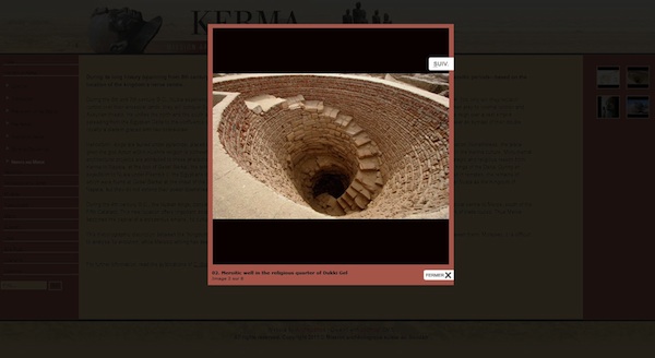
Fig. 2 – Example of image with caption
The section Research contains a short history of past research, several historical pictures, and a list of archaeologists involved in the project.
The section Archaeological Sites opens with a clickable map showing the location of the main sites. The articles continue to be very short, illustrated with images accessible through the right menu, and with links to scholarly publications at the bottom of the page (fig. 3).
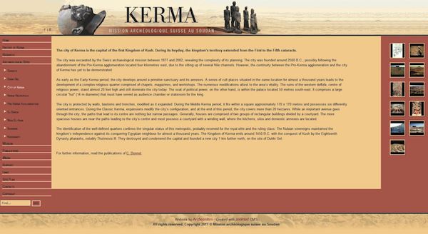
Fig. 3 – The page on the settlement of Kerma
The section Museum includes a photograph of the newly built museum at Kerma, practical information about it, its location (through interactive satellite pictures from Google Maps, fig. 4), some notes and pictures (e.g. plans and display cases), and a virtual tour (fig. 5) showing mostly the architecture of the museum as well as some shelves and local people looking at the displays.
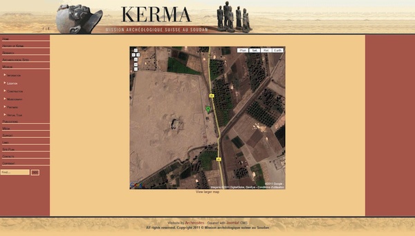
Fig. 4 – Google Maps within the Kerma website
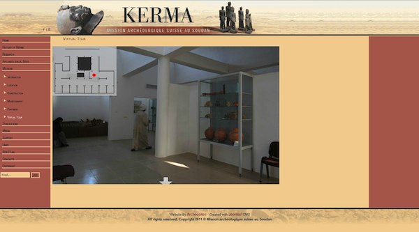
Fig. 5 – Virtual tour
The section Publications contains a substantial list of books and articles organized by topic. For several entries a small icon indicates that a PDF copy of that article can be downloaded from the site (fig. 6). Alternatively, all PDFs are collected in sub-section PDF Publications. Sub-section PDF Excavation Reports makes accessible all excavation reports in the PDF format. Reports are cleverly divided into chapters to avoid downloading very large files.
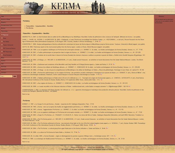
Fig. 6 - Publications
The section Media (fig. 7) contains links to multimedia files and a list of mass media broadcasts, mostly available from other sites. A few panoramic images rendered through JavaScript are directly accessible within the website. There is one radio broadcast accessible directly at the click of an icon.
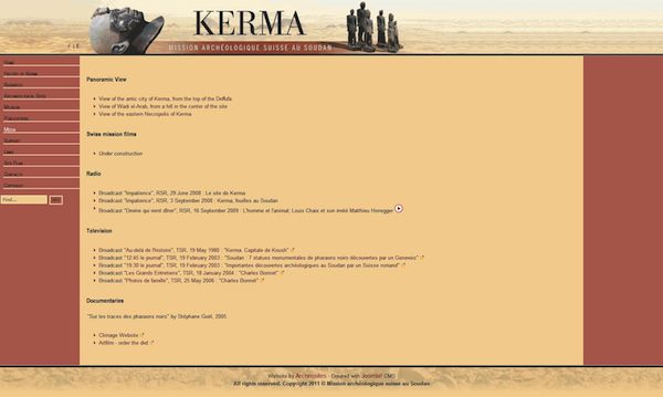
Fig. 7 – Media
Videos of television broadcasts are accessible through links to other sites. A DVD has been produced and is available for purchase.
The other sections are of lesser importance to the visitor. The section Support is really a short statement about the institutions that have contributed to the project. The section Links contains several useful links (not all working) about similar projects, relevant research institutions, and journals publishing relevant articles. All links are organized in categories. The Site Plan section shows the basic structure of the website (not an archaeological site), but the news section is excluded, as it was added after the initial publication of the website. The section Contacts provides a mailing address for the project together with email addresses for the project and some individual participants. On this section appears also a login box used by administrators to access management tools and perhaps private contents.
The search function works well, but the contents of the PDF files have not been indexed.
Conclusions
The Kerma website is undoubtedly one of the better designed academic websites currently available in the archaeological field. It is responsive, neat and uncluttered. It is squarely aimed at the general public, with simple texts and pictures that state key facts in easily understandable language. It also includes easy access to scholarly articles and full reports. It contains plenty of interactivity, including interactive maps, a virtual tour, and efficient handling of dynamic galleries of pictures as well as audio and video files. There are plenty of PDF files, well organised, and the general impression is that everything is in the right place, with simple structures and menus simplifying the task of accessing the desired information fast. The designers have understood that sometimes it is necessary to provide multiple routes to contents. Some pictures appear in multiple places; links to publication pages are often duplicated for access from different spots; and the PDF files are available through several pages.
There is concise practical information about visiting the excavations, and there are contact details for enquiries. There is a consistent effort to show how the building of the museum, the involvement of local authorities, and the establishment of the Foundation Kerma make this a project in which the local community is included. The decision to show local people exploring the ancient culture of their own ancestors and their land while browsing the rooms of the museum is one example of this effort. Despite the showcases being few and not very visible in the tour, one has at least the impression that the museum is not deserted and benefits the local people.
The quality and quantity of scholarly publications is impressive. This website provides plenty of information to scholars, even if the vast majority of pages in its current layout target a general audience. The balance between different audiences seems intentional: individuals can easily find contents most suitable to their needs without feeling excluded or ignored in any section.
As noted above, the website was developed by Archeosites.ch. It seems as if the website was handed off to the archaeological team at some point, and the team has been able to build on the original site to write additional pages, but no one apparently has been able to insert new pages into the pre-existing layout or modify existing pages. For instance, new publications appear in one page in the news section, but these publications have not been inserted in the relevant section, nor does the news appear anywhere in the site map. This suggests that whoever now manages the website may not have a full technical understanding of it. Despite this, the website publishes all contents with a good consideration of different audiences, and the managers were able to add new pages that can be easily found by readers. Furthermore, my own extensive tests with different browsers and platforms show this to be one of the best academic websites from a technical point of view. (It is also easy to archive the contents once the website is complete, although there is no indication on the site of archival procedures in preparation. All web pages can be individually saved with all elements. and the pages can be easily printed to form a volume.) There are no interactive elements that do not serve some practical purpose, nor are there complex designs that may slow some computers (or make the website incompatible with some browsers). The website is elegant, practical, and efficient at delivering its contents. There are more interactive and multimedia features in Kerma than the usual academic website, but they are intelligently designed to use existing widespread technologies. For instance, the virtual tour is a simple Flash animation effectively using a set of pictures, while the panoramic images are JPEG pictures presented through some JavaScript. There are no uncommon or unnecessary technologies being used, and all of what is used is supported directly by the Content Management System, which can be easily updated to maintain support for all these technologies and add support for newer ones. The use of an established, well-designed, and free CMS is also important if one day it may become necessary to transfer some contents to a different platform; chances are that some support and documentation will be available.
The chosen CMS limits the technologies that can be used, but it also provides choices of interactive and multimedia features that can be easily tested and applied with limited technical knowledge. To maintain support for all these technologies one has only to update the CMS occasionally, through documented procedures. It is unnecessary to verify the state of individual components.
The only practical suggestion to improve the website that I could make is to add even more colour pictures of the monuments by using the same interactive interface, with captions. It may be possible to insert pictures from existing collections of private individuals such as those found in Flickr®, after permission, and in that way engage the public through a limited use of social media. Scholars are not immune from the social media bug either (e.g. Academia.edu). As it is, the website of Kerma is excellent and more friendly than average to the general public and scholars alike.
I do have some concerns regarding data sharing. The website (re-)publishes preliminary reports and other scholarship in PDF format, often formatted professionally, and some of those publications contain data. Yet there is no database of artefacts or any scientific data made available. The purpose of an archaeological excavation is ultimately to record faithfully and share as much information as possible, given the destructive character of archaeological fieldwork. I would argue that at least some sharing of (published) data should be part of the website that includes preliminary reports. A database not only makes it easier to search for specific items, but it allows researchers to use new software to make calculations or analyses not previously possible. I fully understand the reticence of some scholars to share data, which is an inheritance of past ways of doing archaeology when all scholars had to defend their work from unethical competitors. I understand as well the complexity of producing and updating a Web-based database. Nevertheless, databases can be very useful, and most modern excavations will produce several just to share data among the team members. Websites are an excellent venue to provide data to empower researchers, and while PDFs remain a simple and useful vehicle to exchange information, the Web is now mature enough to exchange raw data. For that purpose, nothing else compares to it.
The ease of updating the website (i.e., the website did not need rewriting to be updated), the many interactive and multimedia features, and the excellent compatibility of the web pages in different browsers suggest that it is possible to build and maintain sophisticated websites with basic technological competence. (It seems to have been done here by outsourcing the building of the website and then only needing personnel able to update it.) I also think this website was done with a modest budget, since updating a website based on a good CMS costs less than modifying or rewriting a paid-for template — assuming some good advance planning. Printed publications may still represent the core of the scholarly production, but a website is an excellent venue to distribute materials in electronic format, distribute multimedia materials that would be difficult to publish through traditional media, and engage the public.
Kerma outsourced its website development, and a superior CMS has been used. There does not seem to be an explicit archival plan for the materials on the site, and there are no data files available for scholars. Otherwise, it is one of a few academic websites that can demonstrate the practical accessibility of web pages, thorough planning, the identification and correct management of different target audiences, and the proper use of multimedia features. Furthermore, all this is done maintaining usability on both readers' and content publisher's sides. The server is responsive; the contents scale correctly to the dimensions of the actual browser window; printing is as easy as possible; access to the PDFs is well-structured and easy; the interface is intuitive; the management of two languages works as intended (with each page published in both languages concurrently and the switching between languages occurring at page level); copyright notices are present but unobtrusive. This is one website that works.
-- Andrea Vianello
All articles in the CSA Newsletter are reviewed by the staff. All are published with no intention of future change(s) and are maintained at the CSA website. Changes (other than corrections of typos or similar errors) will rarely be made after publication. If any such change is made, it will be made so as to permit both the original text and the change to be determined.
Comments concerning articles are welcome, and comments, questions, concerns, and author responses will be published in separate commentary pages, as noted on the Newsletter home page.