
| Vol. XXV, No. 1 | April, 2012 |
Articles in Vol. XXV, No. 1
Changing Web Standards and Long-Term Web Access
Can we really use the web for important text?
-- Harrison Eiteljorg, II
§ Readers' comments (as of 5/15/2010)
Website Review: Glassway, Glass from the antiquities to the contemporary age
An older website that can serve as an exemplar.
-- Andrea Vianello
Website Review: The Acropolis Virtual Tour
Spectacular imagery in search of a rationale.
-- Harrison Eiteljorg, II
Project Publication on the Web — Addendum II
The importance of multiple languages for websites.
-- Andrea Vianello
Digital Data in Archaeology
Where do digital data fit?
-- Harrison Eiteljorg, II
To comment on an article, please email
the editor using editor as the user-
name, csanet.org as the domain-name,
and the standard user@domain format.
Index of Web site and CD reviews from the Newsletter.
Limited subject index for Newsletter articles.
Direct links for articles concerning:
- the ADAP and digital archiving
- CAD modeling in archaeology and architectural history
- GIS in archaeology and architectural history
- the CSA archives
- electronic publishing
- use and design of databases
- the "CSA CAD Layer Naming Convention"
- Pompeii
- pottery profiles and capacity calculations
- The CSA Propylaea Project
- CSA/ADAP projects
- electronic media in the humanities
- Linux on the desktop
Search all newsletter articles.
(Using Google® advanced search
page with CSA Newsletter limit
already set.)
Website Review: Glassway, Glass from the antiquities to the contemporary age
Andrea Vianello
(See email contacts page for the author's email address.)
Glassway, Glass from the antiquities to the contemporary age
- URL: www.glassway.org/vetro/
- Authorship: Editor: Lorenzo Appolonia. Authors of texts: Rosa Barovier Mentasti, Daniela Ferrari, Patrizia Framarin, Rosanna Mollo, Mario Moretti, and Marco Verità. Website developed by Andrea Guarda, Cristina D'Arienzo, and Enrico Romeo.
- Site host: Private hosting service based in Italy.
- Peer review: None stated.
- Permanence: No explicit information, but it has been available for a decade now.
- Archival procedures: None stated for the website.
- Languages: Italian, French and English.
"Glassway, Glass from the antiquities to the contemporary age" is the website of an interesting international research and learning project concerning all aspects of research on glass. The project operated between 2002 and 2004 and was sponsored by the European Union. It involved academic research, museum cataloguing work, and varied output encompassing academic printed publications, museum exhibitions, a video freely distributed as DVD, and a website. The international character of the project is evident from its availability in multiple languages (though not in all the languages represented by partners: Spanish is missing). I decided to review this website, breaking the late trend of reviewing websites very recently published, because it is multilingual, interdisciplinary, and makes use of multimedia in the real sense of the word. For a website designed nearly a decade ago, it uses very pleasant graphics and does not appear outdated. In fact, it is a good website even by modern standards, and it has been available for some time despite not being actively developed after 2005.
General overview
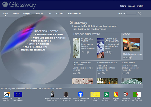
The Glassway website is optimized for a specific display resolution (SVGA 800x600), widespread in mainstream consumer computing at the time the site was created and now suitable for mobile devices. Most browsers can zoom the website if it appears too small, and it resized gracefully in my attempts. The layout of the home page (fig. 1) is very neat and similar to modern websites. Title and language menu appear on the first line (blue band); menu and search form appear on the second (light grey band) and a full menu divided into "resources" (on the left) including a sitemap and "paths" (on the right). An abstract picture complements rather than distracts from the main body. The credits appear at the bottom. There are no repeat items, unnecessary menus, or sophisticated animations; everything appears functional and yet the result is elegant.

Click here to see the home page at full size
in a separate window.)
The website has been written in Italian and then translated into other languages. It appears that the English version would have benefited from a review by a native speaker, but the result is not too bad. The layout of the website is mirrored in all languages, though all contents are available only in the Italian version. Switching languages brings a user back to the home page. This is not the best practice now that dynamic websites are easily developed, but it used to be the norm in the days of static websites. At least the clear interface and availability of a sitemap helps one jump to any page very quickly. The home page highlights one of the many short videos taken from the full length DVD: these are useful and integrate different media very well. Videos open on a popup window (without restrictions in size or function) and use a streaming server to deliver the contents. Visitors are asked to select the bandwidth available to them, 56k or ADSL: think of mobile and broadband in today's jargon.
The home page (figure 1) provides access to the main sections of the website. Clicking on any section will open a new page, of course, but with a third menu on the left that includes subsections and colour-coded sections. In addition, one may access the sitemap at any time; it is found separated from the other items to distinguish it. On the right, more pages are highlighted in the same style of the home page, some presenting a thumbnail-sized picture. The menu on the second line is repeated at the end of this section, but it remains unobtrusive because it is very small and the menu merges with some graphics and blends with the design.
Each section is an authored paper containing much text and a few tables and pictures; the name of the author is repeated in each page. Hyperlinks in the text are used very sparingly. The texts are well-structured and split into subsections of one page. At the end of the texts a further menu appears, providing access to the other subsections of the website. Only the immediately preceding and following pages are included (2 on each side if available) in the form of hyperlinked numbers, but the titles of the preceding and following pages begin and end that menu. It is again a neat solution, elegant and highly functional. A few subsections, mainly descriptive, are divided into further subsections, e.g. "Types of Glass."
The expected readership of the website is clearly academic or professional. The website does not dumb down or shy away from scientific jargon or appropriate terminology, even if it may be uncommon to the reader. Indeed, the visitor of this website will be treated as an intelligent reader who can make use of a dictionary if need be. Here the reader can find some useful information and probably learn something new. The general public will find the initial authored papers somewhat challenging but also concise and clear, with very limited jargon. This is, after all, a thematic website on glass, and readers will need to have some serious interest in the topic. This website does what all academic websites ought to aim for; it publishes results of sound research in an accessible manner. The authors take their time (and make use of the multimedia capabilities of web publication) to explain, even if at times only with a picture or video.
Glass of all types and shapes
The first section looks at how glass is produced. It is technical (e.g. "Only silica that contains less than 0.1% of iron oxide (Fe2O3) can be used for sheet production") and updated, but it maintains an historical perspective, stating clearly each step of the way how the techniques have evolved. The section ranges from natural glasses to industrial glasses used in fibre cables.
The section "Artistic Glass and Glass Handicraft" looks at the history of glass production. It is somewhat disappointing that an historical/artistic framework is used for this section because the previous section was very effective in highlighting the complex technology behind glass and the useful characteristics of glass that make it one of the few materials still capable of being reinvented for new uses. It probably mirrors the recent research in different fields, but archaeology here looks out of touch with reality. The historical overview is nonetheless well worth reading. It is biased towards the Aegean and Italy for the Bronze Age and Phoenicia for the Iron Age, with Egypt barely mentioned despite its major role in the production of glass. What is said is generally correct, and the authors list key facts, mention several sites, and have produced useful bibliographies. The bibliographies are as regionally biased as the texts, but the texts are suitable for an academic readership and generally recent enough to be updated. Particular mention should be made of the decision to include works in several languages; such bibliographies are almost non-existent in reading lists for students and increasingly rare in texts as well. Kudos to the authors. Glass has always been a material with an "international character," often exchanged within major trading networks (as the Uluburun shipwreck proves). Its varied appreciation and consumption in different regions in antiquity is indicated well in these readings showing different modern approaches.
The texts are thoroughly illustrated with colour pictures (any image can be clicked to enlarge), drawings, and maps. There are a few links to other useful sections of the website, but for the most part this website is designed to be printed and read. This is obvious from some mistakes (e.g. the reference to "photo 1" in the Iron Age page). The pictures in the text do not have captions. Clicking on the images opens larger pictures with captions, but these typically include only dimensions and inventory number (museum and provenance unspecified). This is not the case for the original edition in Italian; there captions and plenty of data are given for each picture. The French edition sits in the middle; there are captions, but not as informative and complete as the Italian ones. To sum up, an academic text is difficult to translate; so the original text should be always used as reference and for quotes. The presence of additional languages is welcome of course, but readers should be advised that they are reading a translation, which may be partial, inexact, not updated, or otherwise limited. There is no blame in this; replicating the same website in multiple languages, given the changing nature of websites, also multiplies the work.
The artistic (history of art) framework leaves room for a historical narrative for the later periods (post-Roman); the images dotting the texts disappear entirely and the texts gain substantially in length. Again, this mirrors approaches in the fields of study, with glass in archaeology being still approached as the production of artistic artefacts (or being characterised as pure material), and glass being treated as an innovation of historical relevance for later periods (medieval and modern).
The "techniques" section is most useful; here the most important techniques that have been used across time and space are outlined. Here experimental archaeology shows its usefulness, with pictures and short videos of all techniques showing how things work in practice. There are 42 pages to read and watch. Moreover, this section is featured on a DVD, replicating its episodic presentation. All periods and techniques are featured in about one hour and a half of gorgeous video, displaying most of the images present in the website (but with motion: most objects are rotated by hand), plus there are some more not illustrated elsewhere on the website (the later periods are covered as well), and all short videos are also present in their full length. The DVD contains menus and commentary tracks in multiple languages, like the website.
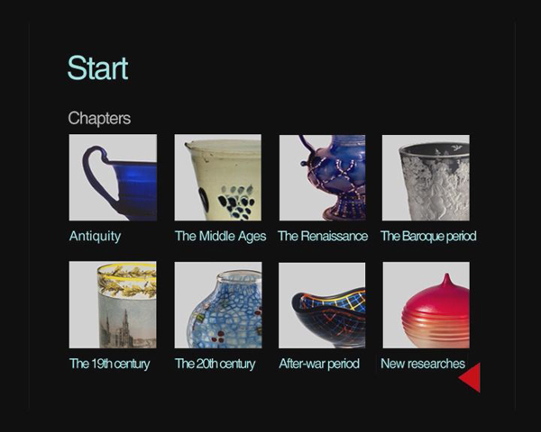
After watching most of the DVD (which may be still available and used to be free to researchers), I can add that seeing the artefacts on a large screen, with some motion to show hidden parts makes a big difference. I have little doubt that in the future colour pictures for publications will be replaced by multimedia presentations; they are really useful to understand and at this point relatively cheap to produce. The section focusing on the different techniques is essential, but because short videos are already used in that section, the DVD adds little more, but provides an alternative (standardised) way to access multimedia contents. The DVD uses chapters and menus to replicate the sections of the website (hence its episodic nature — see figure 2), but it works really well, and the selected artefacts add the "wow" factor even if you are not particularly interested in glass.
A world of glass
The section "Industrial Glass" consists of five articles: flat glass; hollow ware glass; glass tubes; special glass; and glass fibre. This section contains several subsections detailing many types of modern glasses. It sounds like a textbook, without any pictures or room for anything but key facts. Sentences such as "The glass base is composed of silica (SiO2), calcium oxide (CaO), sodium oxide (Na2O) and phosphoric anhydride (P2O5) to which other components can be added to obtain greater chemical stability" (from the bio-glass page) illustrate its technical nature. It is very interesting to note once again a change in the way that the materials are presented to the reader and the change of narrative (or lack thereof) and goals. There is nothing left to be determined or unknown here, and there is no historical perspective about the significance of techniques and materials. There are only scientific facts to be learnt and understood, no less and no more. The author must have been dissatisfied with this, and in a bizarre move (given the previous tone), the website concludes on an environmental note, stating the need to recycle glass. This is very much an appendix to the industrial glass section, an idea strengthened by the fact that both are written by the same author. The website becomes a metaphor of the circle of life, from the natural origins of glass to the end in a dump with a plea to recycle to restart the cycle. It is not wrong (I have recycled glass since I was a kid), just unexpected; it is yet another change of narrative and goals. The technical character will put off most general readers unless they have read the previous sections in their entirety.

Fig. 2 - DVD image showing access to historical chapters
(reduced to fit).
Conclusions
This website has been a pleasure to read, and it has been particularly interesting to look at. It is rare to see international collaborations. It is rare to see academic websites committed to be readable and stay online for as long as possible. (The research project ended in 2002, and the website was finalised in 2004.) It is rare to see a determination to use different languages all the way through to affirm the necessity to break language barriers in academia. It is rare to see a website that targets both the general public and the academic readership, without compromises in quality. It is rare to see a true interdisciplinary collaboration, showing divergent goals and approaches as there must be in the pursuit of different disciplines. It is rare to see a multimedia website that works with every browser and mobile device. It is rare to see a variety of media used to add something meaningful to the presentation and become embedded in the narrative, essential to it, rather than geeky displays of technologies. This may well be a unique site, a hidden gem of the Web. The only other comparable website (despite the difference in scale) that I can think of is the NASA website, which is also appealing to different audiences and diverging interests (and the production of a DVD accompanying a website recalls specifically the Hubble Space Telescope website).1
In my opinion, space exploration is the most successful scientific pursuit at spreading the word about their achievements and goals. To see archaeology exploiting some similar approaches is most welcome. Archaeology too has the potential for attracting public interest and raise awareness on many topics.
Here we have different narratives, and it is not an easy or elegant task. Texts by different authors are easily recognisable not by the style (especially if read in translation), but by the different approaches and goals. Each one stands to learn and improve from the others. The archaeological part is biased towards one region and one methodology (history of art). The historical subsections lack the art history approach, however, and are less engaging in some aspects; glass was useful, but also beautiful. Bibliographies are also limited to the archaeological articles. The section on industrial glass is very technical, precise, and concise. It has some firm facts to divulge and does not waste time in any narrative. The textbook approach, however, is also flawed by the lack of direction; knowing what one can do with glass fails to engage or suggest possible ways forward. In short, every section with its different approach has its flaws, and together both flaws and merits become evident. It is up to the reader to find a balance. This is how things are in academic publications; there are multiple ways of publishing data, and confronting the different methods may serve as an occasion for all to improve.
This website proves once again that producing an academic website is not an easy task, and that translating its several components into multiple languages is a challenge that stresses the budget for an academic website. Something has to give, either the updates to the core website or the mirroring of pages in multiple languages. To resolve this situation, I think the best way is to do what has been done here, to translate the main texts, making them navigable independently, and not bother with captions and updates. The policy adopted by the team should be stated clearly, however. The casual reader will find the translated texts satisfying, while the interested readers will access the texts in foreign languages with the bulk of text translated. It is important also to educate academics (both students and staff) that the world is a big place with many people; one language is too few in the present global village.
This is an excellent resource, which succeeds in presenting difficult data to a broad readership. Where others have been happy to have a website for the sake of it or dump a database that is difficult to print, here there is a sound attempt to produce a thematic website built on rigorous research that knows what it wants to do as well as its limits. It never uses technologies just to impress. Some technologies, such as streaming, require specific software only available on desktop PCs, but the redundancy of pictures, online videos, and DVDs improve the chance that readers will be able to access it fully for years to come, and that is one of the primary goals for anyone producing an academic website.
-- Andrea Vianello
Notes:
1. Recently, many websites have taken the stance of reducing their textual components. I have noted this trend also on major websites, such as BBC News, where pictures, short quotes, and videos are used, sometimes replacing the entire body of text. The "fear of text" in any form seems a characteristic of the moment: most modern mobile gadgets and digital interfaces now prefer "touch" and "image" (sound familiar?). That may be good for interfaces, but information and contents are still circulated primarily in written (textual) form. In my recent reviews for this same newsletter I found myself wanting longer texts to learn or understand interesting topics. This website has struck the right balance in my opinion, with enough information for most and a rigorous structure that tempts the reader to dip into deeper (and more difficult) aspects, without ever scaring readers with impenetrable terminologies or forcing anyone to have a minimal understanding to access some pages. The curious readers here can learn at their own pace. Return to text.

All articles in the CSA Newsletter are reviewed by the staff. All are published with no intention of future change(s) and are maintained at the CSA website. Changes (other than corrections of typos or similar errors) will rarely be made after publication. If any such change is made, it will be made so as to permit both the original text and the change to be determined.
Comments concerning articles are welcome, and comments, questions, concerns, and author responses will be published in separate commentary pages, as noted on the Newsletter home page.