
| Vol. XXV, No. 1 | April, 2012 |
Articles in Vol. XXV, No. 1
Changing Web Standards and Long-Term Web Access
Can we really use the web for important text?
-- Harrison Eiteljorg, II
§ Readers' comments (as of 5/15/2010)
Website Review: Glassway, Glass from the antiquities to the contemporary age
An older website that can serve as an exemplar.
-- Andrea Vianello
Website Review: The Acropolis Virtual Tour
Spectacular imagery in search of a rationale.
-- Harrison Eiteljorg, II
Project Publication on the Web — Addendum II
The importance of multiple languages for websites.
-- Andrea Vianello
Digital Data in Archaeology
Where do digital data fit?
-- Harrison Eiteljorg, II
To comment on an article, please email
the editor using editor as the user-
name, csanet.org as the domain-name,
and the standard user@domain format.
Index of Web site and CD reviews from the Newsletter.
Limited subject index for Newsletter articles.
Direct links for articles concerning:
- the ADAP and digital archiving
- CAD modeling in archaeology and architectural history
- GIS in archaeology and architectural history
- the CSA archives
- electronic publishing
- use and design of databases
- the "CSA CAD Layer Naming Convention"
- Pompeii
- pottery profiles and capacity calculations
- The CSA Propylaea Project
- CSA/ADAP projects
- electronic media in the humanities
- Linux on the desktop
Search all newsletter articles.
(Using Google® advanced search
page with CSA Newsletter limit
already set.)
Website Review: The Acropolis Virtual Tour
Harrison Eiteljorg, II
(See email contacts page for the author's email address.)
The Acropolis Virtual Tour
- URL: acropolis-virtualtour.gr/
- Authorship: The Acropolis Restoration Service (YSMA), orbitlab.
- Site host: Not specified as such, but apparently Amazon.
- Peer review: None stated.
- Permanence: No information provided.
- Archival procedures: No information provided.
- Languages: English with Greek versions of monument descriptions but not labels, buttons, or anything on the home page.
This website is still being worked on, to judge by the language of the instructions page: "Video with detailed instructions coming soon… but honestly its [sic] very easy to use…" It should be noted, however, that I have examined the page over some stretch of time, and nothing has changed. Given the current economic conditions in Greece, the site may or may not be maintained, much less completed.
It may be unfair to review this site since it is still under construction, but the images are so stunning that waiting to discuss it seems wrong. There are twenty-three 360-degree panoramic views of the monuments on the Acropolis, five gigapixel views of the monuments, and a series of extremely high-resolution images of the (inner and outer) walls of the Acropolis. The images are the product here, not the minimal text, not the complex navigation system. And those images are exceptional. Having made this opening statement of praise, I must restart with a more straight-forward look at the site.

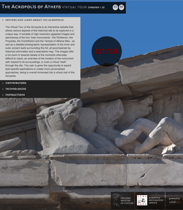
Fig. 1 - The Home Page of the Acropolis Tour Website (reduced to
fit here; select this text to see the actual homepage in a separate
window — with a different photo).
The home page (figure 1) is fairly routine. There are a kind of statement of purpose, a short bit of text about the contributors (the Acropolis Restoration Service, YSMA, and the web technology firm, orbitlab), a simple list of technologies employed that is not very informative (though the list does indicate obliquely that Adobe Flash is required for viewing the site), and the instructions text, all of which is in the quotation above. Unfortunately, the statement of purpose ("Explore and learn about the Acropolis") suggests the situation that seems to exist: the site does not have a defined audience but is a way to show that the Acropolis Restoration Service is aware of the web and can dazzle us. The audience and the purpose seem undefined.
The home page suggests both English and Greek versions of the pages, but, oddly enough, the normal presentation has an English-language base. Most parts of the site (buttons, for instance) are in English all the time. It seems that only the building descriptions have Greek versions. For a Greek website this seems very strange indeed.
The main photograph on the page (part of the Parthenon pedimental sculpture in the example shown here) changes when one returns to the home page. One enters the site by clicking on the "enter" button (that changes into a stylized owl when the cursor arrives) sitting in the center of the home page, in the area of the photograph.

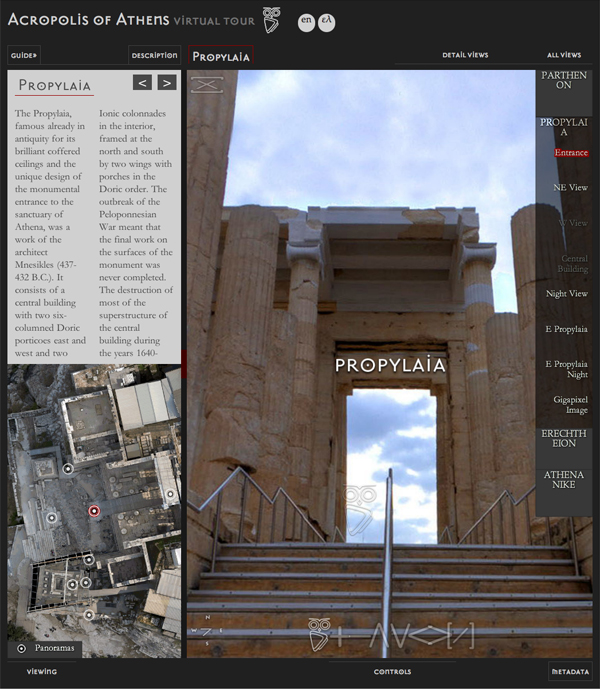
Fig. 2 - The Propylaea Page of the Acropolis Tour Website (reduced to
fit here; select this text to see the actual page in a separate window).
The first page to which one is taken (there are no choices for the user in this) presents the Propylaea (spelled Propylaia at this site), and its design is typical of all the pages concerning the four monuments. (See figure 2.) I will forego a description, relying on the images to show the page. Navigation is generally not difficult, but there are features that, despite what is said in the instructions, need explanations. Indeed, there are individual icons the points of which I have not been able to divine after multiple attempts. (I therefore suspect that some of the things I was using a mouse to do can be done in other ways.) Nevertheless, it seems to me that most moderately experienced web users will figure out how to navigate and interact with the site effectively, if not optimally. I think most users, for instance, will figure out how to allow the images to occupy the full screen and how to remove unwanted parts of the page so that only the desired images and information remain.
I should note that the plan view in the lower left of the basic pages aids navigation. It should also be noted that choosing Metadata brings up, as promised, data about the photograph in view: the date and time of the photo, its location in x-, y-, and z-coordinates, and its size in pixels. There is no credit to a photographer, no exposure information, and no processing information, indeed, no technical information of any kind about individual photos or photographic processes.
The panorama photos are the prime offerings here. As noted above, there are twenty-three of them. Each has an icon indicating the direction of view at the moment so that the user can be properly oriented at all times; in addition, the stylized owl icon will pop up where there is a point from which another panorama has been taken, and clicking on the icon will bring up the other panorama. (It does not seem to me that the inclusion of other photo points in the panoramas is reliably consistent.)
The associated text is very disappointing. The short passages, one about each of the four buildings covered — Parthenon, Erechtheum, Propylaea, and Nike Temple — are not only short. They are not very informative while, at the same time, using surprising vocabulary. The use of the term amphiprostyle in the essay about the Parthenon (an essay of fewer than 350 words concentrating on the history of the structure) particularly caught my eye. This seems to me to reflect an uncertainty about the intent of the site. Were the audience more carefully defined, one might expect text of a specific style and depth.
There is one problem with the panorama photographs that occurred to me only after looking at the site several times. The technology used (nowhere explained on the site) provided full 360-degree panoramas - measured both horizontally and vertically. That is, one may not only pan fully around a circle; one may also pan up and over, so to speak. That is not quite accurate. One may pan around and around in horizontal bands (at various speeds, magnifications, and upward- or downward-aimed orientations); panning up, however, stops at straight up, and panning down stops, similarly, at straight down. Otherwise, one would experience a variety of difficulties that I will not try to describe here.
The important part of the way the panoramas have been created with full 360-degree coverage is this: Every part of the world visible from the point where the camera is placed is included in the photo. Therefore, the sun must not be visible from the camera's position. Taking a photo with the camera aimed so as to include the sun in the image just won't work well. The creators of the website have taken the easy way out of this dilemma; they have taken all the photographs late in the day with either buildings or clouds blocking the sun.
There is a significant advantage to this approach. The absence of strong, direct lighting means that all parts of a given panorama have enough light to be clearly visible. That is, a photo taken at a time and sun position that highlights the west façade of the Parthenon would leave the east façade of the Propylaea in fairly deep shadows. The more diffuse lighting in these photos makes this problem almost nonexistent.
There is also a downside to this generally diffused and soft lighting. The resulting photographs are lower in contrast and impact than they would have been with direct sunlight creating sharp shadows and brighter highlights. The result is clear when one compares the panoramas with the detailed photographs of the buildings — the gigapixel images that are the other major offering of the site. The gigapixel images are far more appealing photographs (at least to this viewer) because of the higher contrast and added impact.
It might have been possible to find a middle ground by using a panorama form that provided 360-degree coverage along the horizontal axis but not the vertical. (See the Wikipedia article on panoramic photography at en.wikipedia.org/wiki/Panoramic_photography for some discussion and examples of panoramic photographs.) However, absent any discussion at the website, it is impossible to know if there were specific reasons for the approach chosen or experiments conducted to compare differing approaches.
Whether or not one would have preferred more contrast and resulting visual impact, the panoramas provide marvelous images of the Acropolis and its monuments. Viewers can have a very good appreciation of the whole of the setting with these images. The images should be especially valuable to anyone who has not experienced the site in person.
The gigapixel images provided at this website are a second group of superior images. Unfortunately, there are only five of these gigapixel images. (Gigapixel images are composed of a billion pixels if the term is taken literally. The images often have even more pixels; viewers are generally quite shocked to realize that they may zoom in for truly remarkable detail. These images have, in the last few years, been seen on the web showing large scenes, e.g., the Inauguration of President Obama, that permit zooming in to see individual faces in the crowd. See gigapan.com/gigapans/033ef14483ee899496648c2b4b06233c?fullscreen_redirect=true for the inauguration photo and note that zooming in allows one to see that Supreme Court Justice Clarence Thomas appears to be asleep.)
The five gigapixel images of the buildings on the Acropolis (east and west façades of the Parthenon, south face of the Erechtheum, an interior of the porch of the Erechtheum, and an interior of the central building of the Propylaea) are equally amazing in terms of the clarity and detail provided. Indeed, on the images of the Erechtheum's north wall I was able to see tool marks very clearly on the new blocks used to restore the wall. Unfortunately, there is no certain way to zoom directly to the maximum resolution with one pixel on screen for each pixel in the image. There is a point at which further zooming stops, indicating that one has reached a one-pixel-on-screen-per pixel-in-the-image resolution, but I found no simple zoom-to-max icon or token. (Here again instructions might make this issue more clear.)
I was disappointed by the small number of these images — and by the, to me, odd choices of the interiors of the Propylaea and Erechtheum. Both were intended to present important details and were therefore aimed at particular examples (the restored Ionic capital and nearby portion of the ceiling in the Propylaea and the moldings carved above the doorway and the ceiling of the north porch of the Erechtheum). I would have preferred a wider selection of overview images before moving to such details, especially for the Propylaea for which there are no gigapixel exterior views. In addition, there is no gigapixel image of the Nike Temple at all. But my preferences are not particularly relevant. The images presented are stunning. Navigating is direct and simple.
The final set of images presented at this site, those of the circuit walls of the Acropolis, are not called gigapixel images, but they seem to be. One may zoom in to an incredible degree and see quite impressive detail. It is difficult, though, to understand the point of these images. For a non-specialist, they serve little or no purpose. How many tourists spend time looking at the walls of the Acropolis, no matter how much time a guide wishes to lavish upon them? (The description provided — one short text passage for all the circuit walls — certainly would not make a casual visitor spend extra time looking at these images. I note in passing that I could not get the text to display correctly in my browser.) For a specialist, on the other hand, information about the images would be required to make them truly useful. As it is, there is nothing to tell us how these images have been made, and they present portions of the walls as if they were simple, vertical surfaces moving along nicely straight and regular paths. Thus, as impressive as the images are, their utility escapes this reviewer.
All in all, there is much to admire in this site. The panoramas are very impressive, and the gigapixel images are even more impressive. A sense of purpose, however, is missing, and even using individual images in a classroom setting is problematic because the technology used does not yield a new web page (and, consequently, a new URL leading to the current page, as displayed) for a new image. As a result, there is no way to return to a particular set of image plus associated information; one must recreate one's path through the site or otherwise go through the site "live" to get to any particular point of interest.
For whom does this site exist? For what purpose? It strikes me as all too typical of web sites with their own niches; the point seems simply to display mastery of something, to dazzle rather than truly to inform, educate, or enlighten. I suspect that this is often the case because there is a desire to show some particularly impressive new technological twist or some exciting new information. It would be far more difficult — and probably more difficult to fund — to set out to do a comprehensive site about the Acropolis that included these images but aimed for more enlightenment and education. As the site exists, though, I find it hard to come up with a rational explanation for its existence with such wonderful resources and so little to offer beyond imagery. Given those responsible, a truly comprehensive and educational site about the Acropolis should not have seemed beyond reach. It seems to me that, at the least, this material could have been put up as a part of a more ambitious project.