
| Vol. XXIII, No. 3 | January, 2011 |
Articles in Vol. XXIII, No. 3
Bridging the Communication Gap: Should academics go public with what they know?
Speaking beyond the walls of academe.
-- Peter A. Young
Project Publication on the Web — I
The first questions are easy to ask, harder to answer.
-- Andrea Vianello, Intute and Harrison Eiteljorg, II
Website Review: Petras Excavations
An archaeological project published on the web.
-- Andrea Vianello, Intute
Aegeanet
A short history of the long-running listserv.
-- John G. Younger
A Review: AutoCAD® for the MAC 2011
More like an upgrade than a new version.
-- Harrison Eiteljorg, II
The Skies Are Clouding Up Even More
Keep your data where you can find them.
-- Harrison Eiteljorg, II
To comment on an article, please email
the editor using editor as the user-
name, csanet.org as the domain-name,
and the standard user@domain format.
Index of Web site and CD reviews from the Newsletter.
Limited subject index for Newsletter articles.
Direct links for articles concerning:
- the ADAP and digital archiving
- CAD modeling in archaeology and architectural history
- GIS in archaeology and architectural history
- the CSA archives
- electronic publishing
- use and design of databases
- the "CSA CAD Layer Naming Convention"
- Pompeii
- pottery profiles and capacity calculations
- The CSA Propylaea Project
- CSA/ADAP projects
- electronic media in the humanities
- Linux on the desktop
Website Review: Petras Excavations
Andrea Vianello, Intute
(See email contacts page for the author's email address.)
Petras Excavations
- URL: http://www.petras-excavations.gr/
- Authorship: Archaeological site directed by Dr. Metaxia Tsipopoulou. Website developed by Konstantinos Togias.
- Site host: Private hosting service based in the UK.
- Peer review: None stated.
- Permanence: No explicit information.
- Archival procedures: None stated for the website.
- Languages: Greek and English
General overview
The Petras Excavations is the official website of the excavations at Petras, a Minoan palatial site located in eastern Crete. The website was launched in 2010, and it is a good test case of a recent website presenting an archaeological excavation with both scholars and the general public as targets. Together with Nick Eiteljorg the author is exploring the possibilities and issues in preparing such websites, and I shall make a few references to our side-project in the review (Such references will appear in this format: [* . . . ]).
The home page of Petras Excavations opens with a Flash™ animation showing some artifacts. The layout is clear and consistent throughout all pages: a menu appears on the top, right providing access to the News, Forums (empty at the time of review), Contact (through a form), Links and a search form. A further menu at the bottom of the top banner provides access to the main sections and sub-sections of the website, and it allows the user to switch languages between Greek and English. A further menu at the bottom provides access to the home page and some pages already linked by the top, right menu.
All contents of the website are copyrighted with "all rights reserved," as stated at the bottom of each page. This most protective licensing solution contrasts with the choice of "Free and Open Source Software" (in the form of the Drupal Content Management System) stated just two lines down. A Creative Commons license reserving all rights for publications and broadcasts would have been preferable as the website itself is a publication. All images are also visibly watermarked with a copyright notice; all these matters taken together, leaving aside potential legal problems in interpreting national copyright laws, the website may appear not very welcoming. The existence of a Public Outreach program (second page in the Home section) suggests that the team understands how important it is to reach the public, but apparently the distrust or uncertainty over publishing on the Web has prevented the website from becoming a point of contact with the public. [* The definition of the audiences of a website is an essential step to undertake before producing the website].
The choice of using a commercial private hosting company (probably based primarily on price) is also a concern for an academic website. During the time spent on the review, the website became unreachable (without message) or inaccessible reporting "Too many connections" and other MySQL errors for about
Home sweet home for scholars
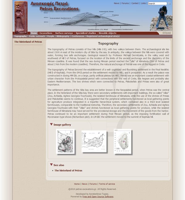
The first section is entitled Home and contains all information that would interest a scholar in a series of sub-pages. The concise and clear page on topography (Figure 1) introduces the archaeological site, presenting the layout that characterizes most other pages. (This layout is preferable to the animation on the current home page. The animation serves no purpose and simply slows the loading of the page.)

Fig. 1 - Topography Page (Reduced by nearly half to fit here,
but note that right- and left-hand portions are parts of
the page as it normally loads.)
A short text is followed by a gallery of images, each of which can be zoomed in on just by clicking (dynamic HTML code and scripts are used); there are then suggestions for other relevant pages. Further sub-pages confusingly appear on the left, next to the text. On a typical page there are therefore links to navigate the website in six different menus: the right menu at the top of the layout; the two lines of the main menu at the bottom of the fixed banner; one menu to the left of the text; and two subsequent menus at the bottom, one variable and one fixed. This is unfortunate.
The Public Outreach page contains a simple listing of occasions on which Petras was promoted to the public, making available posters and various other documents in JPEG and PDF format, and presenting several images in galleries. There is no comment or suggestion for someone wishing to visit the site, and for this reason such contents will be of use only to an academic audience. The People page contains extensive galleries of images, all without captions, and a list of staff members, each with a webpage presenting a short bibliography. The Guestbook (book of visitors) at the site has been scanned and published in PDF format. The Bibliography page is exactly that, with several (most) papers linked and freely available in PDF format. The Conferences page presents the latest conference only, with program, abstracts, and posters advertising the conference available as independent files. A gallery of images taken during the conference, all without captions, concludes the page, together with a video (DVD compatible MPEG-2, 75 Mb) featuring a slideshow of the images accompanied by music and special transitional effects. There is no comment on the outcome of the meeting except for a thank-you note aimed at the funders, INSTAP, and published in their newsletter Kentro. The Registered archaeological sites page (in Greek only) provides links and information to the official permissions that determine which areas can be investigated and what their legal statuses are. There is a lot of information for specialists in these pages, but most scholars will be interested in the papers available in the bibliography. It is not difficult to see how the MySQL database could be swamped by requests by this section alone given the number of dynamic menus, pictures, scripts and files. [* A website is made of many parts, and each needs to be in working order and within the assigned budget. Contents, layout, accessibility and user-friendliness, server requirements, updates and maintenance, long-term availability and archiving need all to be discussed at an early stage. A professional webmaster should be involved, at least in an informal chat involving key aspects, because a scholarly website is not a personal website].
Petras for all
Petras is an important archaeological site with strata ranging from the Neolithic to the end of the Bronze Age. Two neopalatial houses and a palatial structure (founded during the Middle Minoan IIA period) have been found. This is a major Minoan site, one of the few Minoan palaces known, and therefore of high interest to anyone researching, studying or simply curious about the Minoan civilization. All other sections of the main menu, namely Excavations; Surface surveys; Specialized studies; and Movable objects, are aimed at a broad readership, with a rigorous structure, familiar layout (of course the abuse of menus remains confusing), concise and clear texts, and plenty of images (again all dynamically zoomable but without captions). All images have a copyright notice superimposed (sometimes obscuring fundamental information such as the legend of plans – see Figure 2) and are of lower quality than they should be, possibly because the team members fear having them re-used.

Fig. 2 - Copyright notice obscuring a legend.
It is the lack of captions however that concerns me. Some pictures, such as the plans, are understandable by anyone; some pictures of objects and materials provide a guide to the trained eye (and perhaps frustration to those not trained in Minoan archaeology); and some are mysterious and unusable even to provide an approximate idea of what has been discovered so far. In archaeology, context is fundamental to infer the meaning of the archaeological evidence, and the lack of precise information makes many pictures no more usable than a haphazard and heterogeneous set of nice illustrations for a tourist brochure: aimed at attracting the eye, not explaining. [* Scholarly websites should maintain user-friendliness above cute layouts at all times: their primary raison d'être is to make data available to the public].
The Excavations section would be otherwise very good in presenting Petras, as it is well-structured, and it offers a page for the each of the main structures or aspects of the excavation. The section also includes information on trial excavations that, together with information from the surveys in a separate page, provides an excellent window into unpublished studies. [* This approach adds layers of information page after page, allowing both laypeople and specialists to use the same text, each individual finding their way to the desired level of detail is the best possible, and it succeeds here.]
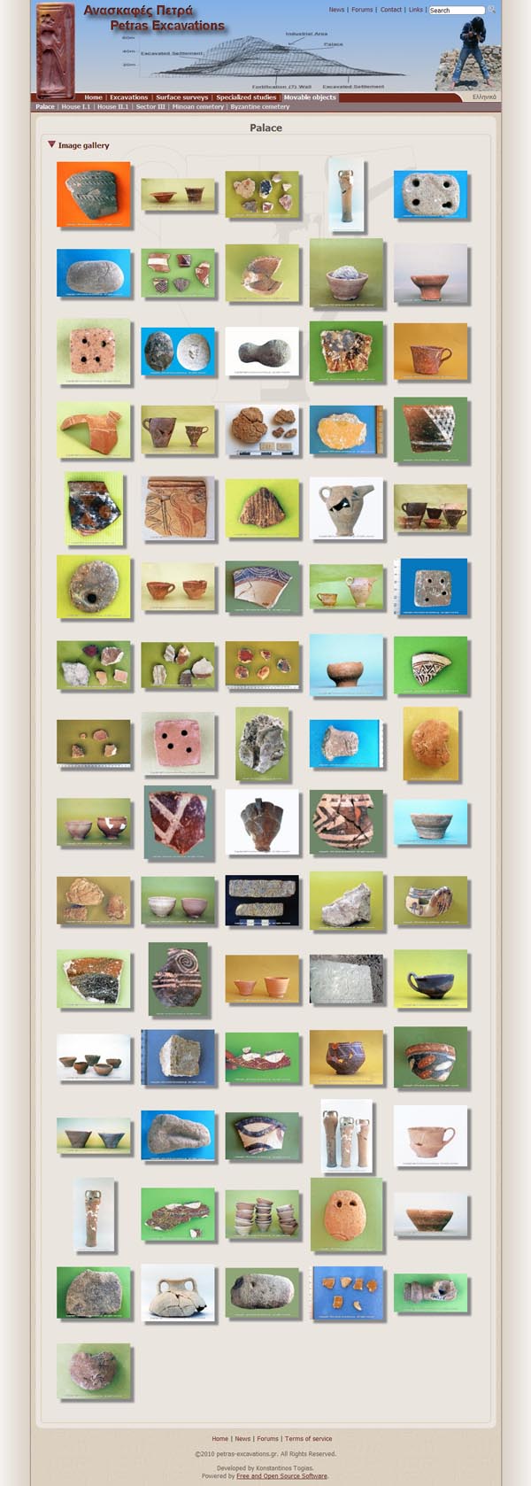
Section Specialized studies is a missed opportunity. Here short articles from staff members outline ongoing research. Each PDF file/study is on a separate page. It appears that further articles may be published justifying the categorization implied by the separate pages, but categories could have been created after more articles had become available. [* Websites should be updated with more data and necessary changes to the layout as research progresses, instead of being designed entirely at the onset. Otherwise incomplete or idiosyncratic interfaces may be produced, and these can affect the ease of navigating a website for long time. Given the fast pace of IT developments and the relatively slow and unpredictable pace of scientific research, layouts and data that at one time seem an obvious development for a website may become outdated by the time an update is ready and for this reason an academic website should not have placeholders for future updates unless these are being produced and a date of publication is known.] Each article is 1-3 pages long, including bibliography and pictures where available. These could have been articles summarizing some key research in a short space, but they seem to lack an audience. Betancourt's article is clearly labeled "abstract" (one of the best) and only one, Triantaphyllou's article, is readable as "preliminary report" or overview of studies. The other texts seem adapted from grant proposals or conference abstracts and should be in the mini-biographies of the authors. The final section, Movable objects, only contains galleries of images (Figure 3), again with copyright notice and without captions. Although they are divided by area, their use is quite limited for both scholars and laypeople. There is no indication whatsoever that at least some of the pictured objects may be seen by anyone at the Sitia Archaeological Museum in north-eastern Crete. Similarly, and there is no practical information to access the archaeological site, which is an open and signposted archaeological park.

Fig. 3 - Movable objects from the palace. (Also reduced by nearly half.)
Conclusions
To conclude, the website contains a useful section squarely aimed at scholars, who will be pleased by the number of academic papers made available. The concise texts of the Excavations and surveys sections are also very useful. The many images represent the greatest weakness of the website: they are poor quality, with an intrusive copyright notice; they use scripts that pose an excessive stress to the underlying MySQL database; and they lack captions. I welcome the use of many images, even if low resolution ones, watermarked and potentially causing problems to the availability of the website (but an image-rich website using advanced scripting in that area may need a separate server to run). The presence of many images counters my own gripe with most archaeological websites: that they are excessively textual, often nothing more than the bibliography section. The many other sections and files are also a good first step towards a successful website, as a general audience is targeted. I would have left out the Specialized studies and Movable objects because they are nothing more than a bunch of texts (the studies) and pictures (the objects' section) cobbled together without a clear aim. The need for captions is clear and critical. I also recommend merging the menus. It seems to me that the website would have benefited from more planning before its assembly. This strikes me as a rare case where less data (in the form of specialized studies and images) would have improved the readability of the whole. The last two sections could have been added later, when something suitable for publication was ready. A website need not be produced in a single effort; it can be expanded and updated.
Some practical information is always appreciated, and the site should have mentioned the town of Sitia, promoting a visit (at least to the local museum). As it is, people may be fascinated by the findings at Petra and still be unaware of how to access such wonders. The almost obsessive copyright notice and the lack of practical information may suggest unhappiness in presenting the archaeological site to the larger public, though this definitely does not seem to be the intended aim of the website or the team. Scholars may find the website far friendlier than other visitors, but only within the Home section. I certainly hope that the website will not be abandoned, but instead developed further, because the team has something to say, and the Internet is a good place to say it.
-- Andrea Vianello
Notes:
1. The connectivity problems described here happened in two instances at the first attempt to connect to the website on one day and were not caused by any unusual or intensive activity of the reviewer. They are evidence of down-time from real use and therefore pertinent to the review. The Editor of the CSA Newsletter experienced a similar problem. Return to text.

All articles in the CSA Newsletter are reviewed by the staff. All are published with no intention of future change(s) and are maintained at the CSA website. Changes (other than corrections of typos or similar errors) will rarely be made after publication. If any such change is made, it will be made so as to permit both the original text and the change to be determined.
Comments concerning articles are welcome, and comments, questions, concerns, and author responses will be published in separate commentary pages, as noted on the Newsletter home page.